
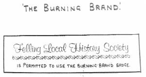
The Flaming Brand of The Felling
The Brandling family crest, a burning brand, was used as the basis of the design of a logo for the first municipal organisation of The Felling which was the Felling Local Board in 1868, using, for the first 5 years of its existence, the Committee Rooms of Felling Co-op, before moving into 4 Wesley Tce. Henry Miller was appointed Surveyor
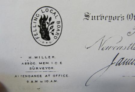

Henry Miller
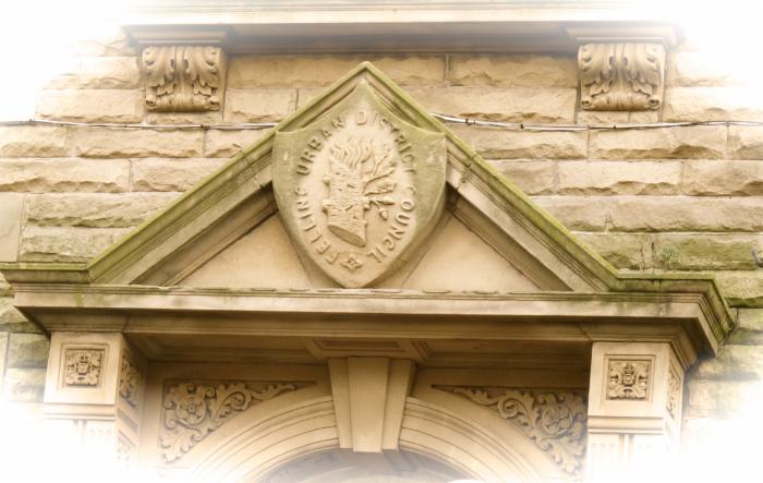
In 1902 he designed the Council Offices of the successor organisation Felling Urban District Council and the flaming brand logo was carved into the stonework above the front door
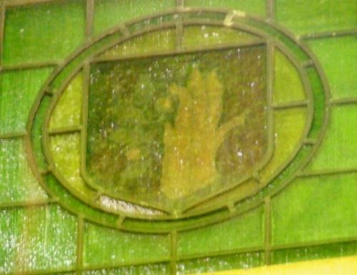
The brand was also on a stained glass window of the Council Members chamber
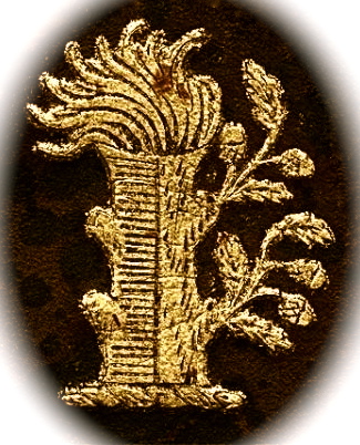
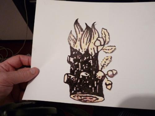
Here it is as a logo design I worked on for The Felling Heritage Group. It is the photo of the stone carved flaming brand with a pencil outline added and the shape cut out
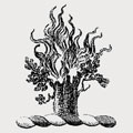
The Branding family crest is described as follows
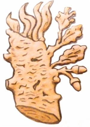
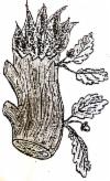
On a wreath a stump of an oak tree couped (cut off) party per pale Or (gold) and Vert (green), from the top issuing flames of fire, from the sinister (left) side issuing two sprigs of acorns, all proper. By left is meant left so far as concerns the carrier of the crest...it means right to us as the lookers
On a wreath a stump of an oak tree couped (cut off) party per pale Or (gold) and Vert (green), from the top issuing flames of fire, from the sinister (left) side issuing two sprigs of acorns, all proper. By left is meant left so far as concerns the carrier of the crest...it means right to us as the lookers
This pic shows the wreath on which the stump stands but it has the sprigs coming from the back on both sides
Here is an embroidered version of the stump standing on a wreath
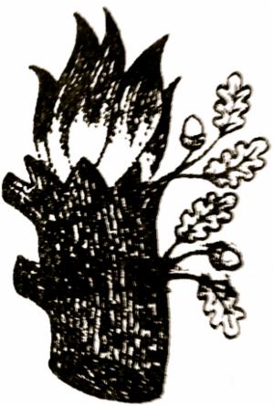
This is another design I adapted from one used on Felling Urban District Council stationery
Yet another adaption
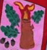
Brandling Primary School's take on the Burning Brand
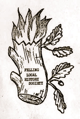
And here's the version used by Joan Hewitt in her File on Felling series for Felling Local History Society
To be critical...the acorns are too tinchy
I'm told that Council officials and members oft wore lapel badges, with the burning brand design, and members of Felling Male Voice Choir, and of Felling Rotary Club had badges and/or rings bearing this logo. A nice variation, using only part of the symbol..(oak leaves and acorns), was used, at one time, by The Felling Male Voice Choir, now symbolised by a stylised version of the biological sign for male 
(This is the bio symbol, not their logo)
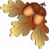
Not being from The Felling (but my father was) I considered it odd that the Labour controlled Felling Council used, as its symbol, the family crest of a ruthless family with no compassion for its workers. This is not a view shared by Felling folk, generally. Its a strong image. It involves a tree, which is symbolic of The Felling of trees...even though this is unlikely to be the true derivation of The Felling name. Nevertheless, it's carved into Felling folk law. We're still here but the Brandlings are long gone and, most importantly, its become "wor image and identity". I agree but I personally prefer, as a symbolic design, acorns and oak leaves. There's this one below or a number of other designs sprinkled about this website
Jon Bratton 2014


The Felling